Top UI / UX Trends for Medical Device Design

Medical device manufacturers are feeling a massive paradigm shift. Their products are being measured against smartphones, VR headsets and similar consumer technologies. As a result, medical devices must deliver a pleasant, intuitive and engaging user experience (UX). It’s not enough for medical device user interface (UI) to look sleek and advanced — every aspect of the interface must be fine-tuned to optimize usability and safety.
Current Medical Device Design Trends
With market expectations at an all-time high, medical device manufacturers are eager to meet those expectations by adding new features and improving their products. The following nine trends cover some ways medical device manufacturers can design experiences to meet and exceed rising standards.
1 – Interactive Virtual Reality
Virtual Reality (VR) allows people to experience real things in a virtual environment. Immersive, interactive, simulated environments provide excellent opportunities for training and learning. For example, a doctor can prepare for an advanced surgery using VR training exercises.
VR training is a safe way to practice procedures and get repetitions before seeing a live patient. Beyond the educational and surgical planning applications, VR can stimulate mental and physiological processes for patients. As medical device manufacturers identify additional use cases, VR is becoming more common in university research and hospital settings.
2 – Skeuomorphic Design
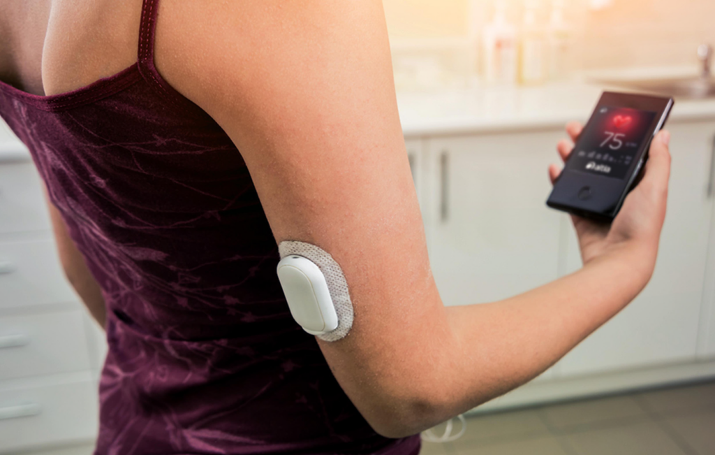
Improving medical device user interfaces has been a focus for years, particularly relying on recognizable visual cues to enhance the user experience. For example, a stethoscope icon or EKG readout symbol might replace the words “heart rate” on a medical device screen.
One of the primary benefits of such visual cues is that they empower language-agnostic designs. Text-based designs might require you to translate the phrase “heart rate” into numerous languages for potential users. An icon of a stethoscope or an EKG readout is clear regardless of whether the patient speaks English, Spanish or Chinese.
When conceptualizing visual design elements, medical device product teams can choose between flat and skeuomorphic designs. Flat design results in a simple, two-dimensional representation of an object. Adding skeuomorphic qualities like shadows and color variations can give elements the appearance of being shiny or existing in three dimensions.
Choosing a skeuomorphic design is one of the most prevalent healthcare UX trends today because it makes for visually appealing interfaces. However, skeuomorphic design isn’t always the answer. Flat design is still ideal in some situations:
- For secondary and non-critical controls
- When the device only contains one or two buttons
- When on-screen cues help users differentiate interactive controls from static text
Skeuomorphic design touches like subtle gradients and drop shadows can give controls a more nuanced appearance. However, being too heavy-handed with it can do more harm than good to aesthetics and usability.
3 – Data Visualization
Visualizing patient data helps doctors and medical researchers gain valuable insights. Clear visualizations strip the complexity away from the data and bring the most helpful information to the forefront, allowing healthcare professionals to work more efficiently to provide fast and impactful patient care.
Instead of poring over a spreadsheet or writing database queries, patients and healthcare professionals can identify trends and outliers at a glance. Simple, straightforward data visualization also has a place in patient-facing medical devices. For example, Tandem Diabetes Care leveraged smart technology to transform their medical device UX.
4 – Interactive Chatbots
Interactive chatbots help patients access information and support with minimal friction. Providing instant answers to routine queries makes self-service easier for patients. People prefer that healthcare UI software to be interactive, and chatbots introduce a simulation of the human element. When chatbots handle monotonous and repetitive tasks, employees can focus on the work that requires human intervention.
5 – Voice Interface
Voice interfaces are becoming more useful — in your phone, at home and, now, in medical devices. Like interactive chatbots, voice interfaces provide patients and healthcare professionals with yet another way to access information quickly and conveniently.
Hands-free usability is especially valuable to patients who may not have full use of their hands. Voice interfaces give these patients the option to access application functions without help. Similarly, healthcare professionals can use voice interfaces to control technology without putting down their scalpels, needles or forceps.
6 – Customizable mHealth Apps
Mobile health apps are yet another way to increase the accessibility of information and functionality. Patients can use mHealth apps to take control of their healthcare from just about anywhere with email access. Customizable apps make the user experience more convenient, especially for patients who aren’t by a desktop or laptop all day.
mHealth apps increase patient engagement in a number of ways:
- Sending reminders and allowing changes to appointments
- Providing updates related to drug recommendations or other resources
- Personalization of notifications and other features
- Mobile tracking of health and fitness metrics
- Offering video chat capabilities for telemedicine
Flexible customization makes mHealth apps easier to use and understand.
7 – Patient-Centric UI Design
Most of the growing healthcare UX trends share something in common. It’s all about putting patients at the center of the interface. From text size and typeface to the speed of screen scrolling, there are countless opportunities to make medical devices more pleasant and intuitive. When the device is created with the patient’s needs in mind then it’s likely that the patient will be more successful using it—less time and stress trying to figure out how to use the device, for example.
Ease of use is paramount, and not just for patients. For example, when Medtronic developed an FDA-Certified Medical device, they did so with the mindset that physicians and clinicians don’t have time to specialize in all kinds of different devices. Rather than putting the onus on healthcare providers to study the device, they created a simple touchscreen design with multi-language support.
8 – Flexible BOM Built In
Medical device OEMs have learned a lot of hard lessons during the chip shortage. When their device GUIs are limited to a single chip, production ceases when that chip becomes unavailable. This is a hard lesson that many device manufacturers have learned in recent times.
Designing flexibility into a GUI is a smart new strategy for keeping medical device production going for now and for the future. Selecting GUI design tools that support a wide range of hardware is key to that flexibility.
9 – Cloud-Based Design
Even beyond the chip shortage, the post-pandemic world creates challenges for all types of design teams and device manufacturers:
- Dispersed teams
- Supply chain issues
- Shipping and labor costs
- Disparate hardware-software stacks
All of these challenges can mean costly delays for GUI projects, so GUI teams are looking for ways to speed their development and reduce costs. Hardware-as-a-Service (HaaS) solutions like Altia CloudWare™ enable cloud-based design workflows to shrink or solve those problems.
Optimizing UX for Medical Devices
These nine trends are related as parts of a user-centric design philosophy. In the same way, every feature in a medical device must work together to create a cohesive user experience. Adding elements can help a product stand out and add more value for patients, but it’s also vital to implement features safely.
To see how Altia responds to medical device UI trends without increasing the risk of product failure, request your live demo.
Recent Posts


